Sony RX1, 35mm f2 Carl Zeiss
Thirty fist and last day of “Metamorfoodist”.
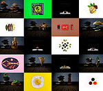
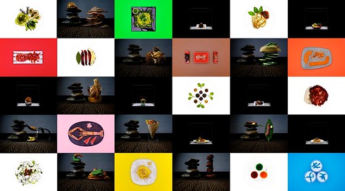
“Transformation”, “Colors”, “Translucencies”, and “Equilibria” menus are here represented in a mosaic to highlight the graphic nature of the photographs.
I want to thank the Chef Lorenzo Mazzoni for the hard and incredible work he did in presenting thirty different recipes divided in four coherent menus. We had a lot of fun together, but I think I’m the one who enjoyed this project most since I had a chance to attempt for the first time some food photography, and I did it with an excellent chef who puts a lot of effort not only in cooking but also in presenting his recipes. Plus I had the privilege to eat all the food I got to shot, and I loved each and every recipe: they don’t just look great, they are all tasty and delicious.
So, here we are, closing the ninth theme of this project/blog and ready for starting a new, different one tomorrow already…
As promised here comes the review for the Metamorfoodist theme:
This has to be hardest theme (so far) for me to review. I don’t have particularly passionate relationship to food, or the particular food you’ve photographed here. I’m used to eat much more common food and I don’t know what to think about this kind of ‘high-end food’. 🙂 But, I have to say that your food photography is totally different from what I’ve seen in common home magazines and such. There is a very distinct flavor of high culture in these pictures and I think you’ve taken it to next level with a creative setups (sincere credits to you of course). I have trouble imagine this at gallery wall, but large scale prints would work very nicely in a restaurant. That said, I’m not sure which one here is the art, photography or the food.
If you are familiar with the work of Lévi-Strauss (famous French anthropologist, not the clothing manufacturer), you would know that ‘cooked food opposite to nature’ represents the constitutive cultural/psychosocial structure in all cultures that allows us to categorize world into symbols of mind (or at least Lévi-Strauss claims so). Cooking food, nuts for example, shifts it from the nature to human culture and adds into it value in a cultural way. Not only does it represent the way humans create boundaries and allow things flow across them (according to pre set rules), it also represent the universal dichotomies which lies in mans mind. The more you cook the food, the more it becomes cultural and opposite of nature, which has to be done to introduce a cultural order in cosmos. Now, representing food with a flavor of high culture, like you have done here, expresses this very core of the idea: something very profound is added to food by putting it out like this. This added value is represented here with visual connotations to high end luxury products, minimalism and cultivated pureness. I think you have succeeded here very nicely, and like I said, you’ve end up with very creative setups that look fresh take of a familiar idea. If you would need to do this again, I would love to see you go against the grain and do something similar with a junk food(!). This might introduce a nice and provoking contrast to the theme.
I’m not sure which menu I like the best, either Metamorphosis menu or Translucencies menu. With a Metamorphosis menu you’ve setup food like it’s a sort of jewelry or something not to be touched. I like it. With a Translucencies menu you have better and more interesting viewpoint to the food itself and backlight gives new and interesting textures and colors to food that we’ve used to see regular ways. Equilibria menu doesn’t work as nicely. Maybe it’s because repetition (stones) or the rather usual underlay. From where I see it, you’ve tried to create minimalist platform, but there is a lack of speciality which other menus have (jewelry setup with lo-key, colors, transparency). Colors menu works, well, because of colors.
Why did I like this theme? I’m sure it’s because you chose something very unexpected and static, and yet you succeeded to make it interesting with a creative setups. I will never look food pictures of the common home magazines same way again! 😀
ps. Love your new theme, takes me right back to those Nex-7 days.